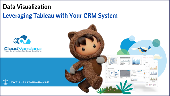
Get the most out of your CRM data using Tableau visualizations! This guide takes you through setting up Tableau for a better understanding of customer data.
It is a powerful data visualization platform that can turn customer relationship management (CRM) data into clear and compelling insights. This guide will take you through the basics of using Tableau to explore and gain a deeper understanding of your customer data.
Connect Your CRM to Tableau
To get started, you’ll need to connect your CRM system to Tableau. This can be done via a direct connection from your CRM to Tableau or by exporting the data from your CRM and then importing it. You should also consider whether you want to pull in any additional data sources, such as web analytics or survey feedback, which could give you more context for your visualizations.
Understanding Data Types and Structures
Knowing your data types and the structure of your data is essential for creating meaningful visualizations. First, look for any problems in the data itself, such as missing or duplicated records, which could impact the accuracy and usefulness of your visuals. Then, identify each column’s data type. Analyzing this information can help you understand what kinds of visualizations will work best for each column (e.g., bar graphs, scatter plots, etc.), as well as any organization or grouping options that might make sense.
Building Interactive Dashboards for Customer Insights
The platform makes it easy to build interactive dashboards with its drag-and-drop interface. These powerful visuals allow you to quickly explore data and hone in on the most important insights, helping you maximize the value of your customer data. Dashboards can be easily shared with others, so everyone can have up-to-date information at a glance and work together more effectively.
Utilizing Key Performance Indicators (KPIs)
Key Performance Indicators (KPIs) are metrics that allow you to track the success of your customer data. KPIs offer a way to view important activities and trends over time, allowing you to quickly identify opportunities for growth or focus on areas that need improvement. With Tableau, you can easily set up KPIs with drag-and-drop visuals that help you pinpoint strengths and weaknesses within your data.
Creating Advanced Reporting Table Configurations
Once you’ve set up basic data visualizations, you can layer on more advanced reporting tables and metrics for valuable insights. Tableau allows you to shape your data into different views and apply filters so that you have wide-reaching information about customers, products, sales results, and other important subject areas. Advanced reporting tables can provide complex insights that help track customer engagement over time or discover possible market trends.
Are you looking for a reputed Salesforce partner to get end-to-end assistance with your Salesforce projects? Please get in touch with CloudVandana, and get the solution best suited for your business. Call Now.

Digital Marketing Manager at Cloudvandana Solutions
Request a Free Consultation
YOU MIGHT ALSO LIKE
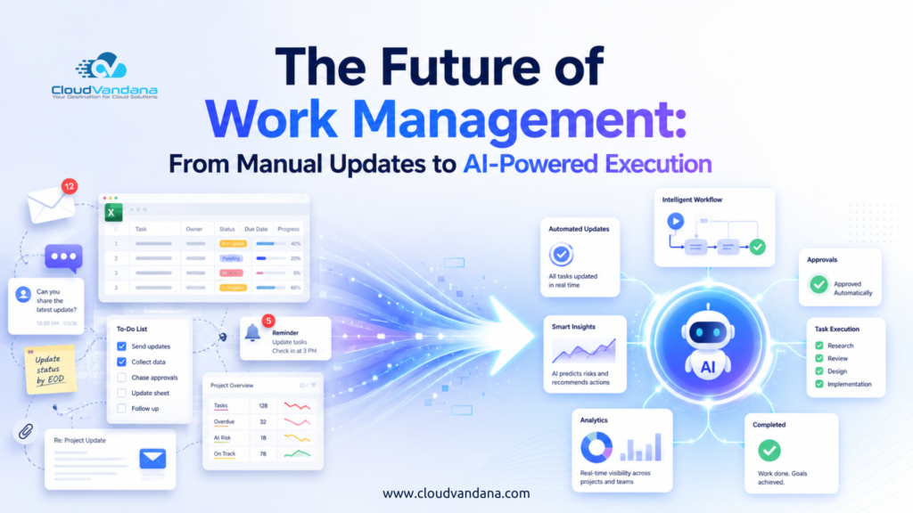
The Future of Work Management: From Manual Updates to AI-Powered Execution
Salesforce Implementation Checklist for Growing Businesses

Salesforce Health Check Checklist: 15 Things Every Business Should Review Quarterly

Salesforce Consulting Services: When Should a Business Hire an Expert?

Salesforce Automation vs AI Agents: What Should Businesses Use First?