

Check a Fields References and Find Reports Using It
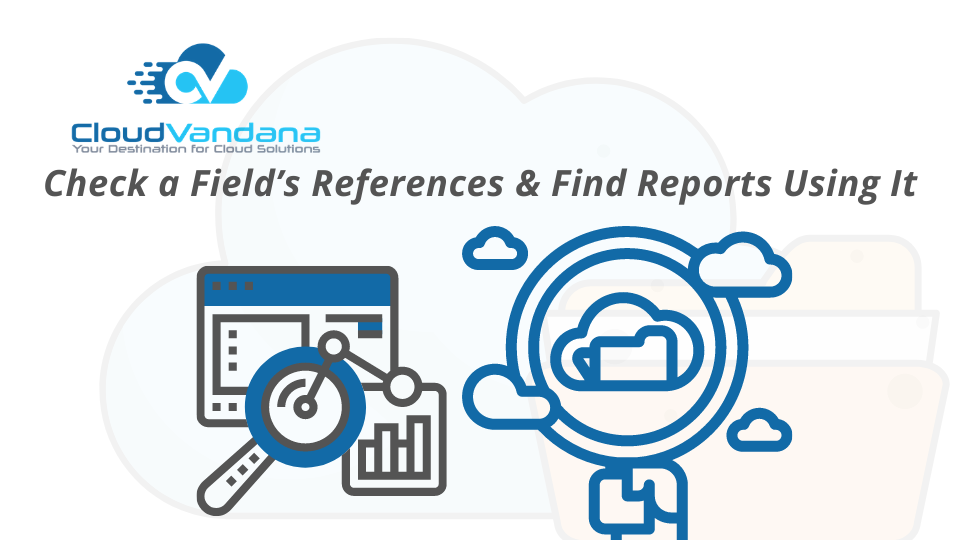
Learn how to check where a Salesforce field is used across reports, flows, Apex, and automations. Discover tools and best practices for field reference tracking to ensure safe changes and maintain org integrity. Introduction Every Salesforce field serves a purpose—but that purpose can become obscured over time. As organizations grow and evolve, fields are added, modified, repurposed, and sometimes forgotten. The danger arises when those forgotten fields are still in use—in validation rules, reports, flows, and automations—making cleanup a risky proposition. Understanding where a field is used, referenced, or embedded is critical to ensuring system integrity and avoiding unintended disruption. This article explores how to comprehensively trace a field’s references and identify reports using it. Why Field Traceability Matters in Salesforce Salesforce is a relational database, and fields are often tightly interwoven into the logic, automations, and reports that drive your business. Removing or altering a field without full visibility into its dependencies can create cascading errors—breaking workflows, corrupting data, or halting user activity. Traceability is also vital during mergers, audits, refactoring, or transitions from Classic to Lightning Experience. Common Scenarios Where Field Reference Checks Are Essential Field reference checks are not just for cleanup. They are mission-critical in several scenarios: Understanding Metadata Dependency in the Salesforce Ecosystem Salesforce metadata defines how components relate to one another. Fields are referenced not just in record pages but in formulas, workflows, Apex logic, and dashboards. They are part of the metadata layer, which dictates configuration behavior. Understanding dependencies across metadata types ensures you don’t break interconnected systems with a seemingly small change. What Happens When You Change or Delete a Field Deleting a field in Salesforce doesn’t just remove a column from your data—it can: Salesforce may stop you from deleting some in-use fields, but not all dependencies are caught at runtime. Silent failures or misbehaving logic may result. Overview of Tools Available for Reference Checking Salesforce admins and developers have a mix of native tools, APIs, and third-party platforms to audit field references. Each tool comes with its own benefits, and often a combination is necessary for complete visibility. Options include: Using Setup Search to Locate Basic Field Usage The simplest place to start is Salesforce’s Setup interface. Searching a field name via Setup will return metadata that mentions it—like validation rules, formula fields, or page layouts. While helpful, this method is not exhaustive. Setup search works best for direct references—not for embedded or indirect logic calls. Explore Where a Field Is Used: Native Salesforce Feature Salesforce recently introduced the “Where is this used?” feature for custom fields. It displays: Though not available for all metadata types yet, it’s a powerful baseline tool—especially for newer orgs using custom fields extensively. Limitations of Native Tools and the Need for Precision Native tools offer snapshots, not full audits. They don’t scan: For full coverage, you’ll need metadata APIs or specialized tools. Checking Field Usage in Validation Rules Validation rules frequently reference fields in formula expressions. Open your Object Manager > Validation Rules and inspect each rule for: A broken reference here will silently disable enforcement. Identifying Field Usage in Workflow Rules and Flows Workflow rules and process builders often use field values in criteria or actions: Use Flow Explorer or debug logs to surface hidden dependencies. Even paused flows may contain critical references to older fields. Tracing References in Apex Classes and Triggers Apex code is a common sink for field usage. Developers may hardcode field names into queries, comparisons, or DML statements. Use: Look for any field name string or dynamic reference. Field Dependencies in Process Builder and Flow Builder In Flow Builder, field references exist in: Field renaming or deletion can crash flows silently or skip actions. Downloading the flow’s metadata can expose hidden dependencies. Finding Reports That Use a Specific Field Reports often mask field dependencies because their metadata is stored separately from object logic. To uncover this: Even one filtered report using a deprecated field can distort analytics. Using “Report Type” Metadata to Locate Field Usage Each report is tied to a report type. If your field is part of a custom report type, reports created from it may include or reference the field. Start by reviewing: This helps narrow your report audit scope. Manually Searching Reports for Field Presence If metadata tools aren’t available, go manual: Slow but effective for limited audits. Building a Custom Report on Report Metadata (via Report API) Use Salesforce’s Report Metadata API to programmatically extract report definitions: With a simple script, you can pull all reports using a specific field—even if it’s not visible in the UI. Automating Field Reference Audits with Metadata API The Metadata API is the most reliable way to scan your org at scale. It exposes: Export metadata as XML, then parse it for your field name using scripting languages like Python or Node.js. Using Workbench to Analyze Field-Level References Workbench is a Salesforce admin’s Swiss Army knife. Log in and navigate to: Workbench doesn’t always show usage context but offers a fast way to audit object-level metadata. Field Usage Analysis in Third-Party Tools (e.g., Gearset, Elements.cloud) Enterprise-grade tools like Gearset and Elements.cloud provide: These platforms are ideal for large orgs with complex environments and frequent metadata changes. Best Practices for Documenting Field Relationships Start a field dependency map: Use spreadsheets, diagrams, or dedicated metadata documentation tools. Role of Field Descriptions and Help Text in Traceability Use the Description and Help Text fields wisely. Add: This reduces future guesswork and helps downstream teams understand the field’s context. How to Use Custom Metadata to Map Critical Fields Create a custom metadata type called “Field Registry”: Now every admin or developer has access to live documentation inside Salesforce. Field Usage Logs and Change History Considerations Use Field History Tracking or Field Audit Trail to monitor: Inactive fields with no updates in months may be candidates for retirement—if references are removed. Preventing Orphaned Fields During Org Cleanup Before deleting any field: Use change sets or dev sandboxes to test deletions before
Get Guidance on Your Company’s Processes in Kanban Views
Learn how to embed process guidance directly into Kanban views. Discover how teams use visual workflows to streamline onboarding, sales, QA, and more with smart Kanban boards. Introduction Effective processes are the lifeblood of any high-performing organization. But even the most well-documented workflows can fall apart when teams don’t have timely, contextual guidance. In modern work environments, especially in tools like monday.com, Jira, and Trello, Kanban views offer more than just visual task tracking—they can become interactive guides that reinforce process steps, expectations, and accountability in real time. Table of Contents Introduction The Rise of Kanban as a Visual Workflow Model Why Process Clarity Matters in Fast-Moving Teams What Is a Kanban View in Modern Work Platforms Distinguishing Kanban from Traditional List or Table Views The Concept of Embedded Guidance in Visual Boards Use Case: Streamlining Onboarding with Visual Prompts Use Case: Sales Pipelines with Stage-Specific Instructions Use Case: Product Development and QA Workflows Where Guidance Lives in the Kanban Experience Column Descriptions: Micro-Instructions at a Glance Card Tooltips and Hover-Based Guidance Automation-Powered Nudges and Alerts Embedding Process Documentation into the Board Connecting Knowledge Bases to Kanban Interfaces Creating a Single Source of Truth for Each Stage How Conditional Logic Enhances Kanban Guidance Using Visual Cues: Colors, Icons, and Labels Customizing Fields to Reflect Stage-Specific Requirements Training and Enablement via Kanban Views Leveraging Integrations for Contextual Support Preventing Process Drift with Inline Coaching Monitoring Adherence to Guidance in Workflow Reports Encouraging Self-Service Without Slowing the Flow Tips for Designing a Guided Kanban Experience Common Mistakes in Kanban-Based Process Design Evaluating Success: KPIs for Process Clarity and Compliance Scaling Visual Guidance Across Departments Future of Smart Kanban: AI-Powered Recommendations Conclusion: Turning Visual Flow into Process Fluency YOU MIGHT ALSO LIKE The Rise of Kanban as a Visual Workflow Model Born out of lean manufacturing, the Kanban model has transcended its factory-floor roots to become a cornerstone of agile work. With its simple columns and cards, it provides unmatched visibility into status, workload, and flow. Today, it powers everything from software development to HR onboarding. Why Process Clarity Matters in Fast-Moving Teams When teams scale or face rapid project shifts, ambiguity kills velocity. Without clarity on who does what, when, and how, even seasoned professionals waste time second-guessing. Embedding guidance directly within Kanban views eliminates friction by answering questions in the flow of work, not outside of it. What Is a Kanban View in Modern Work Platforms Kanban views transform linear task data into a dynamic board, where each column represents a status, phase, or milestone. Items (or “cards”) move left to right as they progress through stages. It’s a natural fit for process-driven work and makes bottlenecks instantly visible. Distinguishing Kanban from Traditional List or Table Views In list or table formats, process steps are buried in rows and filters. In contrast, Kanban’s spatial orientation and stage-specific columns allow users to “see the process.” The human brain is wired for spatial reasoning—making Kanban views cognitively more accessible and action-oriented. The Concept of Embedded Guidance in Visual Boards Guidance doesn’t have to live in a separate wiki or PDF. When woven directly into the Kanban view—via columns, tooltips, custom fields, or automations—it transforms the board from a status tracker into a process companion. Every card movement is an opportunity to coach, not just record. Use Case: Streamlining Onboarding with Visual Prompts For HR teams managing onboarding, each column in the Kanban view can represent a phase: Offer Sent → Paperwork → Equipment Setup → Orientation. Embedded guidance (e.g., “Send welcome email on move to this column”) helps new employees experience consistency, while HR reps stay compliant with policies. Use Case: Sales Pipelines with Stage-Specific Instructions In sales workflows, each Kanban stage—Discovery, Demo, Proposal, Negotiation—demands different actions. By embedding micro-guides into each column, reps know exactly what to do at each stage. For instance, “Attach proposal before moving to ‘Negotiation’” helps avoid premature transitions. Use Case: Product Development and QA Workflows Product teams often manage tasks from design to development, QA, and deployment. Guidance in Kanban helps prevent critical steps from being skipped. A column like “Ready for QA” might include, “Ensure unit tests are complete and linked in the checklist before moving forward.” Where Guidance Lives in the Kanban Experience Visual guidance can appear in multiple forms across a Kanban board: Each layer reinforces process adherence while keeping workflows frictionless. Column Descriptions: Micro-Instructions at a Glance Each Kanban column can include a brief descriptor—something often overlooked. A 1–2 sentence instruction placed at the top of each column can clarify expectations. For example, in a marketing pipeline, “In Review” might say: “Tag content reviewer before moving item forward.” Card Tooltips and Hover-Based Guidance Cards can house field-level tooltips or icon-based help. When users hover over a status, priority, or assigned role, small prompts can explain what’s expected. This enables just-in-time learning, especially helpful for cross-functional teams or freelancers. Automation-Powered Nudges and Alerts Smart automations turn Kanban into a co-pilot. Examples include: These nudges reduce manual policing and reinforce the right habits. Embedding Process Documentation into the Board For more complex stages, teams can embed links to SOPs, video walkthroughs, or Google Docs directly in the card template. This gives users one-click access to the why and how behind each step—no platform hopping required. Connecting Knowledge Bases to Kanban Interfaces Tools like monday.com or Notion allow knowledge bases to be embedded inside boards via widgets or URL previews. When guidance is visually tethered to the task it relates to, users are far more likely to engage with it—and follow it. Creating a Single Source of Truth for Each Stage Each column in a Kanban board can act as a node in your process map. Rather than treating documentation as static, use the board as a living document—where the expectations are not buried elsewhere but front-and-center during execution. How Conditional Logic Enhances Kanban Guidance Conditional field visibility—such as “show this field only in QA column”—lets you streamline the interface while surfacing critical requirements at
Empty the Recycle Bin in One Step in Salesforce
Discover how to empty the Salesforce Recycle Bin in one step. Learn best practices, permission requirements, and cleanup strategies to maintain a lean and compliant org. In the lifecycle of every Salesforce record, deletion is inevitable. Whether it’s obsolete leads, outdated opportunities, or deprecated custom objects, the Recycle Bin acts as a safety net. But like any safety net, it must be cleaned out periodically to keep your environment clean and compliant. Salesforce now makes it easier than ever to empty the entire Recycle Bin in one step—dramatically simplifying org maintenance. Table of Contents What Is the Salesforce Recycle Bin? Where Deleted Records Go—and Why They Stay The Purpose of the Recycle Bin in Data Governance How the Recycle Bin Works for Users vs. Admins Default Limitations in Record Deletion Understanding Soft Delete vs. Hard Delete in Salesforce Manual Recycle Bin Cleanup: The Conventional Approach Why Emptying the Recycle Bin Matters The Impact of Cluttered Recycle Bins on Org Health Data Retention Periods: 15 Days and What That Means Who Can Empty the Recycle Bin? Permission Requirements The “Empty Org Recycle Bin” Button: Where to Find It One-Click Cleanup: How to Use the Empty Recycle Bin Feature Automating Recycle Bin Cleanup with Apex Using Salesforce Workbench to Purge Deleted Records The Dangers of Premature Deletion Backup Before You Purge: Best Practices for Protection Auditing and Monitoring Recycle Bin Activity Recycle Bin and Large Data Volume (LDV) Environments Differences in Recycle Bin for Classic vs. Lightning Sandbox vs. Production: Managing Recycle Bin Strategies Third-Party Tools for Enhanced Deletion Management Considerations for GDPR and Compliance When Emptying the Bin Strategic Cleanup: Monthly, Quarterly, or Trigger-Based? How to Recover from Accidental Mass Deletion Educating Your Users on Safe Deletion Protocols Building a Recycle Bin Policy for Your Org Future of Recycle Bin Management in Salesforce Conclusion: Purging Smarter, Not Just Faster YOU MIGHT ALSO LIKE What Is the Salesforce Recycle Bin? The Recycle Bin is Salesforce’s temporary holding space for deleted records. Much like the trash folder on your computer, it gives users and admins a window of time to restore mistakenly deleted data or permanently remove it when ready. Where Deleted Records Go—and Why They Stay When a record is deleted, it’s not immediately purged from the system. It enters a “soft deleted” state and is moved to the Recycle Bin. This allows for recovery—intentional or accidental—before the record is permanently wiped. The Purpose of the Recycle Bin in Data Governance From a governance standpoint, the Recycle Bin enables traceability and prevents data loss. It creates an audit-friendly trail of recently deleted items and provides a buffer period for data correction. How the Recycle Bin Works for Users vs. Admins End users only see the records they deleted. Admins, on the other hand, have access to the org-wide Recycle Bin, allowing them to manage all deleted records within the org—making them the stewards of complete cleanup. Default Limitations in Record Deletion Salesforce restricts certain deletions: Understanding these boundaries is crucial before performing mass deletion. Understanding Soft Delete vs. Hard Delete in Salesforce Salesforce uses two types of deletion: Emptying the Recycle Bin converts soft-deleted records into hard-deleted ones. Manual Recycle Bin Cleanup: The Conventional Approach Historically, users had to: It was tedious, time-consuming, and prone to oversight. Why Emptying the Recycle Bin Matters A cluttered Recycle Bin isn’t just cosmetic—it impacts storage limits, slows org performance, and introduces risk. Proactive deletion ensures your system remains lean, responsive, and audit-ready. The Impact of Cluttered Recycle Bins on Org Health Leaving thousands of deleted records in limbo affects: In high-volume orgs, cleanup isn’t optional—it’s critical. Data Retention Periods: 15 Days and What That Means Salesforce automatically empties the Recycle Bin after 15 days. However, that’s 15 days from the date of deletion, not from when it lands in the bin. Waiting passively for auto-deletion means living with unnecessary data load. Who Can Empty the Recycle Bin? Permission Requirements Only users with “Modify All Data” permission can clear the org-wide Recycle Bin. For safety, this permission is typically reserved for system administrators or delegated super users. The “Empty Org Recycle Bin” Button: Where to Find It In Lightning Experience: This one-click approach saves hours of manual effort. One-Click Cleanup: How to Use the Empty Recycle Bin Feature When the button is clicked: Always double-check before executing. Automating Recycle Bin Cleanup with Apex Developers can create scheduled Apex jobs to identify and hard-delete records programmatically. Example: apexCopyEditDatabase.emptyRecycleBin([SELECT Id FROM Account WHERE IsDeleted = TRUE]); This allows for automation that complements or replaces the UI-based deletion workflow. Using Salesforce Workbench to Purge Deleted Records Workbench, Salesforce’s powerful admin tool, allows users to: It’s especially useful in sandbox and staging environments. The Dangers of Premature Deletion Emptying the Recycle Bin without review can lead to: Never purge blindly. Review deletion logs or run a WHERE IsDeleted = TRUE SOQL query before final steps. Backup Before You Purge: Best Practices for Protection Always export deleted records before purging. Use: Saving a .CSV archive ensures you have a fallback in case of overzealous deletion. Auditing and Monitoring Recycle Bin Activity Admins should track: Use the Setup Audit Trail, Event Monitoring, or create a custom deletion log with Apex triggers. Recycle Bin and Large Data Volume (LDV) Environments For orgs managing millions of records, Recycle Bin strategy becomes essential. Consider: LDV orgs cannot afford passive deletion cycles. Differences in Recycle Bin for Classic vs. Lightning Classic UI: Lightning UI: Lightning is superior for Recycle Bin management in every metric. Sandbox vs. Production: Managing Recycle Bin Strategies In Sandboxes: In Production: Each environment demands tailored deletion discipline. Third-Party Tools for Enhanced Deletion Management Consider tools like: These platforms offer deeper control, versioning, recovery assurance, and scheduled deletion intelligence. Considerations for GDPR and Compliance When Emptying the Bin For data subjects exercising deletion rights: Full deletion is not optional—it’s regulatory. Strategic Cleanup: Monthly, Quarterly, or Trigger-Based? Set a cadence: Integrate cleanup into your regular admin checklist. How to Recover from Accidental Mass
View and Edit Case Details from the List View with Case Hover in Lightning Experience

Editing case details just got easier with Lightning Experience‘s case hover feature. Learn how to use it to streamline your workflow and save time.It is easy for Agents now to work on the cases and get an overview of the case from a list view. Agents can save time by previewing, editing, and deleting cases directly from the list view with a compact preview that appears when they hover on the case subject. Table of Contents Introduction The Evolution of Case Management in Salesforce Understanding List Views in Lightning Experience Traditional Navigation vs. Modern Inline Interaction Key Benefits of Using Case Hover Enabling the Case Hover Preview Panel Anatomy of the Hover Card: What You Can See Inline Editing from the List View: A Game-Changer Editable Fields vs. Read-Only Fields in Hover Mode How to Customize Compact Layouts for Case Hover Navigating the Case Hover Interface Efficiently Use Case: Rapid Triage by Support Agents Use Case: Supervisor Oversight and Escalation Common Customizations with Hover and List Views Setting Field-Level Access and FLS for Hover Editing Considerations for Page Layout vs. Compact Layout How Hover Enhances Workflow for High-Volume Teams Integrating Case Hover with Omni-Channel Assignments Best Practices for Editing Cases via Hover Panel Performance and Load Time Considerations Limitations of Case Hover in Complex Orgs Tracking Inline Edits for Audit and History Training Your Support Team for Hover Efficiency Using App Builder to Optimize the Case Workspace Comparing Case Hover with Quick Actions Future Enhancements: What’s Next for Hover Features Compliance and Security Considerations Admin Checklist Before Enabling Hover Features Conclusion: Faster, Smarter Case Management with Hover CloudVandana: Accelerate Case Management with Lightning Efficiency YOU MIGHT ALSO LIKE Introduction Customer service thrives on speed, precision, and minimal clicks. For support teams in Salesforce, every second matters—especially when managing high case volumes. The Lightning Experience’s Case Hover functionality transforms how agents interact with cases by enabling immediate visibility and editing directly from the list view. This isn’t just a UX enhancement—it’s a productivity breakthrough. The Evolution of Case Management in Salesforce Salesforce has continually redefined service delivery, evolving from record-centric navigation in Classic to component-driven efficiency in Lightning. Managing cases used to involve drilling into records, scrolling through layouts, and jumping between tabs. Today, with features like Case Hover, agents get essential information upfront—reducing friction and accelerating resolution. Understanding List Views in Lightning Experience List views are filtered tables that display records based on defined criteria. In Lightning, they’re dynamic, configurable, and interactive. They’re no longer passive lists—they’re functional dashboards that serve as mission control for reps and supervisors alike. Traditional Navigation vs. Modern Inline Interaction In the past, working a case meant clicking into the record, waiting for it to load, and navigating through full-page layouts. Modern interaction design shifts that behavior—allowing users to scan, assess, and act within seconds, directly from where they are. Inline editing and hover panels replace full-page transitions with micro-efficiencies. Note: You can modify the compact layout of the case object to show or hide fields in the modal. What Is the Case Hover Feature? Case Hover is a UI enhancement in Salesforce Lightning that reveals case details when users hover over a case number in the list view. The hover card displays key fields, enabling users to preview or edit data without opening the full case record. It’s a compact, context-rich summary that bridges visibility with action. Key Benefits of Using Case Hover Enabling the Case Hover Preview Panel Admins can enable the hover panel functionality by ensuring that: There’s no toggle called “Case Hover”—it activates when conditions are met. Anatomy of the Hover Card: What You Can See The hover card typically displays: What’s shown depends on the compact layout configuration for the Case object. You control what’s visible. Inline Editing from the List View: A Game-Changer Beyond hover, Lightning supports inline editing directly within list view rows. Fields marked as editable (like Status, Owner, or Priority) can be modified without navigating away. Combined with hover, this means agents can scan and act in under five seconds per case. Editable Fields vs. Read-Only Fields in Hover Mode Not all fields can be edited via hover or list view. Editable fields must be: Fields like Case Comments, Rich Text Areas, or lookup formulas are view-only. How to Customize Compact Layouts for Case Hover Go to Object Manager > Case > Compact Layouts. From there: The compact layout defines what appears in the hover panel—not the full record page. Navigating the Case Hover Interface Efficiently Hovering over the case number opens the card. From here, users can: Hovering is instantaneous—no loading spinner, no interruption. Use Case: Rapid Triage by Support Agents In busy support queues, agents use list views to assess priority and status. With hover: This enables triage-like workflows within seconds. Use Case: Supervisor Oversight and Escalation Supervisors need quick oversight without opening every case. Hover lets them: This leads to better prioritization and reduced queue bottlenecks. Common Customizations with Hover and List Views Admins often combine hover with: Together, these enable a command-center experience from the list. Setting Field-Level Access and FLS for Hover Editing For fields to appear and be editable: If a user can’t see a field in hover, check Field-Level Security (FLS) first. Considerations for Page Layout vs. Compact Layout Ensure your compact layout is designed for hover efficiency, not just mobile display. How Hover Enhances Workflow for High-Volume Teams For teams handling hundreds of cases daily: The cumulative effect is massive time savings across shifts. Integrating Case Hover with Omni-Channel Assignments Hover complements Omni-Channel by: This improves match quality and reduces reassignment. Best Practices for Editing Cases via Hover Panel Well-structured hover use leads to confident decisions. Performance and Load Time Considerations Because hover loads partial record data, it’s fast—but impacted by: Test on large datasets to ensure the hover panel loads under 1 second. Limitations of Case Hover in Complex Orgs Hover panels don’t: They are intentionally lightweight. For more, link to quick actions or modals. Tracking
Advanced Techniques for Using Field-To-Field Filters in Filter Reports
Master Field-To-Field Filters in Salesforce to compare dynamic values across fields. Learn advanced use cases, report types, performance tips, and how to optimize filtering logic for smarter insights. Introduction In the enterprise world, precision in data analytics is no longer optional—it’s mission-critical. As organizations scale their Salesforce environments, the need for dynamic, context-driven insights grows exponentially. Traditional static filters no longer suffice in today’s fast-paced reporting landscape. That’s where field-to-field filters come in. Field-to-field filters in Salesforce revolutionize the way reports are structured and analyzed. They enable users to compare one field’s value directly to another field’s value, row-by-row. Instead of applying hard-coded thresholds, you evaluate values in context—comparing forecast to actual, planned date to close date, SLA target to resolution time, and more. This guide explores advanced techniques to leverage this powerful feature to its fullest potential. Whether you’re a Salesforce admin, report builder, business analyst, or CRM strategist, mastering field-to-field filters will elevate your reporting capabilities from static to intelligent. What Are Field-To-Field Filters? Field-to-field filters allow you to compare two field values within the same record rather than comparing a field to a static value. This unlocks record-level logic that adapts to data as it evolves. Rather than saying, “Show Opportunities where Amount > 100,000,” you can say, “Show Opportunities where Amount > Forecasted Amount.” Every record is evaluated on its own merit. There’s no need to define global thresholds that don’t fit all situations. It’s dynamic, personalized logic inside native Salesforce reports. Where to Use Field-To-Field Filters Field-to-field filters are most effective in reports where relative comparisons matter. You can use them in standard, summary, matrix, and tabular reports. Real-world examples include: This flexibility makes field-to-field filters useful across teams—sales, service, finance, HR, legal, and operations. Prerequisites and Enablement To use field-to-field filters in Salesforce, ensure the following prerequisites are met: If the interface doesn’t expose a “Field” option in the filter criteria, check whether Enhanced Report Builder is turned on. Supported Field Types Salesforce supports field-to-field filtering for a subset of field types. These include: Unsupported fields include: If you’re using formula fields, make sure they are simple, performant, and do not contain nested logic that could hinder report load times. Basic Syntax and Logic Structure Creating a field-to-field filter involves choosing two fields and a comparison operator. Available operators include: Example: Opportunity.Amount > Opportunity.Quota__c Salesforce applies this logic across all relevant records in the report, showing only those that meet the condition. The syntax is clean, readable, and directly aligned with the relational model of your CRM. Using Cross-Object Comparisons Field-to-field filters support comparisons between related objects, as long as those objects are part of the report type. For example: If the field isn’t available in the report, create or modify a custom report type to expose it. This unlocks cross-object insight without needing Apex or external tools. Date Field Comparisons Date fields often reflect time-based promises or deadlines. Using field-to-field filters, you can monitor: These comparisons provide automatic tracking of timing discrepancies and can be embedded into compliance or delivery dashboards. Formula Field Considerations Formula fields can be used in filters but must be handled carefully. They are recalculated every time a report runs, which can slow down performance on large data sets. They may also fail if they reference fields not visible in the report type. Avoid formulas that contain nested IF or CASE logic. If necessary, consider caching formula outputs into text or number fields via automation. Picklist-to-Picklist Filtering If both picklist fields share the same value set, they can be compared directly. For instance:Lead.Industry = Account.Industry This is useful for: Ensure picklist values match exactly (including capitalization). Small mismatches or typos will cause silent failures. Using Field-To-Field Filters in Joined Reports Joined reports allow separate blocks of data, but each block supports its own field-to-field filters. This enables more nuanced analysis. For example: Keep filters logically isolated within each block. This structure works well in executive-level dashboards where multiple business dimensions are displayed side-by-side. Combining With Row-Level Formulas Row-level formulas let you compute new values per record. You can then use field-to-field filters to compare that derived value to another field. Example:Create a formula field called Margin = Revenue – CostThen apply a filter: Margin > Margin_Target__c This kind of layered logic allows deeper insights into unit economics, deal profitability, or operational efficiency—all within the native report builder. Segmenting Reports Dynamically Instead of cloning the same report for multiple audiences, use field-to-field filters to segment data contextually. For instance: This keeps reporting agile and reduces maintenance overhead. Performance Optimization Tips Large reports using field-to-field logic can become sluggish. Keep performance in check by: Testing report performance in staging environments with real datasets is essential before rolling out to end users. Common Pitfalls and How to Avoid Them Field-to-field filters can become problematic if not configured properly. Watch for: Advanced Use Case: Territory Comparison A common business need is to verify that opportunities are being assigned to the correct sales regions. A field-to-field filter can detect discrepancies automatically. Filter: Opportunity.Assigned_Territory__c ≠ Opportunity.Booked_Region__c This logic powers territory audits, incentive plan validations, and escalations when deal boundaries are violated. Audit and Compliance Monitoring For regulated industries, field-to-field filters can drive automated exception reporting. Compare: This helps spot procedural lapses without building custom logic or manual review cycles. Enhancing Dashboards With Filtered Data Field-to-field filters improve the fidelity of your dashboards. You can embed filtered reports that show: These widgets are dynamic, self-filtering, and adapt to real-time data without manual updates. Combining With Custom Report Types To unlock powerful comparisons, use custom report types that expose related fields. This ensures both fields appear in the filter builder. Tips: With well-structured report types, your field-to-field logic becomes modular and scalable. Field-To-Field Filters in Historical Trend Reporting If you’re using reporting snapshots, you can track performance trends over time using field comparisons. Example: Time-series comparisons allow proactive alerts, seasonal forecasting, and year-over-year analytics inside native reports. Field-To-Field Filtering in Einstein Analytics Einstein Analytics, now known
Save Time Editing Reports: Disable Automatic Updates in Preview Mode
Boost reporting efficiency in Salesforce by learning how to disable automatic updates in preview mode. Reduce lag, streamline edits, and regain control over complex reports. In the high-stakes environment of enterprise CRM usage, reports are more than data snapshots—they’re decision-making engines. However, as datasets grow and filters stack, waiting for each update to render in preview mode can feel like dragging an anchor. The ability to disable automatic updates in Salesforce Report Builder is a quiet but powerful productivity upgrade that every admin and analyst should understand. The Problem with Auto-Updating Reports Every Filter Slows You Down Each time you adjust a filter, add a column, or tweak a grouping in Report Builder, Salesforce attempts to regenerate the report preview automatically. While helpful in simple reports, this functionality becomes a bottleneck in large data environments. Real-Time Isn’t Always Efficient In complex reports involving thousands of records, multiple joins, and dashboard references, these automatic updates strain system resources and introduce latency. Interrupting the Flow of Thought Creative data exploration demands mental clarity. When the preview pane refreshes after every small adjustment, it breaks concentration and stifles deep analysis. Understanding Report Preview Mode in Salesforce What Is Preview Mode? Report Builder includes a preview pane that automatically displays changes in real time. It helps users visualize what the final output will look like. Default Behavior of Live Updates By default, as soon as you adjust filters, fields, or groupings, the report recalculates. This is controlled by the auto-update toggle. When Preview Mode Becomes a Burden When working with complex joined reports or custom formula fields, these previews can take several seconds—or even minutes—per change. New Feature: Disable Automatic Updates in Preview Mode The Toggle That Changes Everything Salesforce now includes a simple toggle switch labeled “Update Preview Automatically” in the top-right corner of the Report Builder. Manual Update at Your Command With the toggle off, users can make multiple changes and manually click “Update Preview” only when ready. Location and Accessibility This feature is available in Lightning Experience and is supported for tabular, summary, matrix, and joined reports. How to Disable Automatic Updates in Salesforce Report Builder Step 1: Open Report Builder From any report, click Edit to enter the Report Builder interface. Step 2: Locate the Auto-Update Toggle At the top-right corner of the preview pane, you’ll see a switch labeled “Update Preview Automatically.” Step 3: Toggle It Off Once switched off, your report will no longer recalculate until you manually trigger it. Step 4: Click “Update Preview” When Ready After making multiple changes, click the blue Update Preview button to apply all edits at once. When to Use Manual Update Mode Working with Large Data Sets If your report pulls from objects with tens of thousands of records, turning off auto-update avoids unnecessary processing cycles. Building Reports with Complex Logic Multi-layered filters, cross-object formulas, and dynamic dashboards are better handled in manual mode. Collaborating in Shared Report Building When teams co-edit a report, disabling auto-update ensures a consistent, controlled environment where changes aren’t overwritten prematurely. Productivity Gains for Analysts and Admins Batch Editing Filters and Fields Instead of waiting for the preview to load after each change, users can now edit all filters and columns before committing the update. Reduced Cognitive Friction By reducing screen flicker and cursor lags, manual update mode creates a smoother, more focused editing experience. Improved Load Performance Fewer auto-refresh cycles means less load on the system, especially in orgs with many concurrent users. Admin-Level Tips for Controlling Update Behavior Train Users to Use the Toggle Intentionally Include this step in admin documentation and training modules. Power users should know when and why to disable automatic updates. Consider Profiles and Permissions While this setting is per-user, consider communicating its value across analyst-heavy roles where efficiency is critical. Evaluate Report Performance Across the Org Use debug logs and usage metrics to determine if auto-update is straining system resources during peak hours. Common Pitfalls and How to Avoid Them Forgetting to Re-Enable the Toggle Users might forget that auto-update is off, leading to outdated preview panes. Always remind them to hit Update Preview before saving. Misinterpretation of Old Data If you’re presenting from a preview that hasn’t been updated, you might display stale metrics. Build habits around confirming updates before exporting or sharing. Confusion in Multi-User Environments When multiple users edit the same report, lack of synchronization between preview states can cause confusion. Use version control practices. Comparing Report Performance Before and After Disabling Auto-Update Benchmarking Load Times Use browser developer tools to track how long a report takes to load with and without auto-update enabled. User Feedback and Focus Groups Run a feedback session with power users and analysts to gauge productivity improvement. System Logs and API Calls Track backend logs for fewer preview requests and server hits. Enhancing Your Report Building Workflow Use Templates to Minimize Edits Create well-structured templates so you don’t need to rebuild filters and layouts each time. Label Draft Reports Clearly Use naming conventions like “[DRAFT] Q2 Pipeline” to indicate that a report is in edit mode. Integrate With Dev Sandboxes Use developer orgs for building large reports, then deploy into production once optimized. Tips for Power Users Use Keyboard Shortcuts in Report Builder Navigate faster using Salesforce’s built-in keyboard shortcuts. Combine Manual Preview with Field History Tracking If you’re analyzing trends, pair this feature with field history data for a richer audit trail. Schedule Final Reports Post-Approval Only activate report subscriptions after manual previews have been validated. Best Practices for Organizations with High Report Volume Document the Use of Auto-Update Toggle Include this setting in your report governance playbook. Standardize Report Types and Formats Avoid overuse of custom formats that demand frequent previews. Assign Report Stewards Designate experienced users to review performance-heavy reports monthly. Integrations That Complement This Feature Einstein Analytics vs. Standard Reports Understand where auto-preview is helpful and where it slows you down—use Tableau CRM for heavier analytics. Slack Alerts for Updated Reports Connect Salesforce reports to Slack
Clear Your Cache Anytime on Salesforce Mobile App (Android)
Learn why and how to clear cache on the Salesforce Mobile App for Android. Discover expert tips to improve app performance, sync accuracy, and mobile CRM efficiency for users and admins alike. Table of Contents Introduction: Why Clearing Cache Matters More Than You Think Understanding the Salesforce Mobile App for Android The Mobile-First Imperative Key Differences Between Desktop and Android Experiences App Performance and Cached Data What Is Cache in the Context of Salesforce Mobile App? Defining Mobile App Cache What Gets Stored and Why It Matters The Balance Between Speed and Stale Data Common Scenarios Where Cache Becomes a Problem Updates Not Reflecting on Mobile Data Sync Issues and Ghost Entries Visual Glitches and Performance Lag How Salesforce Mobile App Manages Cache by Default Cached Objects and Offline Mode Smart Sync vs. Manual Refresh The Role of Local Storage When and Why You Should Clear Cache Manually Resetting After Major Updates or Customizations Fixing Stubborn Sync Errors Enhancing Security in Shared Device Scenarios Step-by-Step Guide: How to Clear Cache on Android for Salesforce Mobile App Step 1: Open Device Settings (Not the Salesforce App) Step 2: Navigate to “Apps” or “App Info” Step 3: Locate and Tap “Salesforce” Step 4: Go to “Storage & Cache” Step 5: Tap “Clear Cache” Step 6: (Optional) Tap “Clear Data” – When to Use with Caution How Often Should You Clear Cache? General Guidelines Based on Usage Type Power Users vs. Occasional Users Admin Recommendations for Company-Wide Use Impact of Clearing Cache: What Gets Reset? Things You Won’t Lose: Login, User Preferences, Permissions Things You Might Need to Reinitialize: Recently Viewed Items, Offline Data Tips to Maintain Optimal App Performance Without Frequent Cache Clearing Using the In-App Refresh Feature Wisely Keeping the App and OS Updated Syncing Data on Strong Networks Advanced Admin Tips for Controlling Cache Behavior Mobile Device Management (MDM) Considerations Using Login Flows and Lightning Web Components to Guide User Behavior Monitoring and Auditing App Usage for Cache-Related Issues What If Clearing Cache Doesn’t Work? Escalating the Issue: Logs, Support Tickets, and Debug Logs Reinstalling the App: A Last Resort The Future of Cache Handling in Salesforce Mobile App Potential Improvements in Smart Cache and Predictive Syncing Trailblazer Feedback on What Needs Fixing How Salesforce Is Addressing Mobile App Performance Gaps Comparing Salesforce Mobile Cache Management With Other Enterprise Apps Slack, Microsoft Teams, HubSpot, and Google Workspace What Salesforce Can Learn (and Teach) About Mobile Performance Conclusion: Keep It Light, Keep It Fast, Keep It Synced CloudVandana’s Mobile Enablement Strategy FAQs About Clearing Cache on Salesforce Mobile App (Android) YOU MIGHT ALSO LIKE Introduction: Why Clearing Cache Matters More Than You Think In the fast-paced world of mobile-first business operations, every tap, swipe, and sync has to perform flawlessly. Salesforce Mobile App for Android offers enterprise users immense power at their fingertips—but when performance slows or data doesn’t sync as expected, the culprit is often one hidden layer: the cache. Clearing your cache isn’t just a routine hygiene tip—it’s a strategic maintenance step that can dramatically impact your productivity, accuracy, and mobile experience. Understanding the Salesforce Mobile App for Android The Mobile-First Imperative Salesforce mobile app isn’t just a miniature version of the desktop platform—it’s a full-fledged productivity hub. Designed for field reps, service agents, marketers, and mobile executives, the app offers real-time access to CRM data, dashboards, notifications, and collaboration tools. In an age where remote workflows and hybrid teams are the norm, mobile CRM isn’t a luxury—it’s a lifeline. Key Differences Between Desktop and Android Experiences Unlike the browser-based Lightning Experience, the Android app runs locally with synced data and offline capabilities. This means it stores content, user inputs, and settings in local device memory. While this enables speed and offline access, it also introduces data persistence issues when updates occur or data becomes stale. App Performance and Cached Data Cached data improves speed by eliminating the need to re-fetch information every time a record is viewed. However, over time, excessive caching can lead to bloated memory, sync mismatches, and outdated record views—especially when layouts, automation, or field values change on the backend. What Is Cache in the Context of Salesforce Mobile App? Defining Mobile App Cache Cache refers to temporarily stored data—like API responses, images, user sessions, and record lists—that the app keeps to reduce load time and bandwidth consumption. It’s stored on your Android device’s local memory. What Gets Stored and Why It Matters Think of cache as a shortcut. The app stores your recent accounts, contact views, reports, filters, and even interface settings locally so you don’t have to re-download them. This is great for speed, but if you’ve recently updated records or field visibility settings in Salesforce, you may not see those changes reflected until the cache is refreshed. The Balance Between Speed and Stale Data While cache accelerates load time, it can become a liability when it fails to keep pace with real-time updates. In critical business workflows—like pipeline tracking or case resolution—seeing yesterday’s data can lead to flawed decisions. Common Scenarios Where Cache Becomes a Problem Updates Not Reflecting on Mobile Admins roll out changes to layouts, record types, or picklist values—only to hear users say they still see the old interface. The issue? Cached page views. Data Sync Issues and Ghost Entries Sometimes a record is edited or created on a desktop but doesn’t show up on mobile. Or worse, it appears twice. These are signs that cached data is not syncing properly. Visual Glitches and Performance Lag Fonts misalign, components don’t load, or scroll actions become laggy. All of these could indicate the cache is overburdened or corrupted. How Salesforce Mobile App Manages Cache by Default Cached Objects and Offline Mode Salesforce Mobile App uses Smart Sync to download key objects—like Opportunities, Leads, or custom objects—based on offline settings. It stores metadata, record IDs, and even attachments locally depending on configuration. Smart Sync vs. Manual Refresh Smart Sync updates cached data automatically based on usage, but it doesn’t always
Salesforce and Trailhead Branding Elements No Longer Appear on myTrailhead

Explore how the removal of Salesforce and Trailhead branding from myTrailhead affects user experience, customization, and corporate enablement strategies. Learn how to adapt and maintain learner engagement in a streamlined UI environment. Introduction: The Changing Face of myTrailhead Salesforce’s myTrailhead once stood as a beacon of fun, personalized learning—draped in bold, colorful branding, quirky mascots, and signature Trailhead identity. But over the past few months, something significant has shifted. The familiar Salesforce and Trailhead branding elements are quietly disappearing from myTrailhead instances across organizations. For system admins, enablement leaders, and UX strategists, this subtle visual evolution is more than a cosmetic change—it’s a paradigm shift that could influence learner engagement, corporate identity, and how Salesforce positions its enablement ecosystem. Understanding myTrailhead: A Quick Recap myTrailhead is Salesforce’s white-labeled learning experience platform built on the same technology as Trailhead. It enables companies to create customized training paths, publish internal enablement content, and gamify learning within the Salesforce ecosystem. myTrailhead offered the same look and feel as public Trailhead, complete with badges, characters, and celebratory animations—but with the ability to replace those elements with company-specific branding. The Original Branding DNA of Trailhead The Trailhead experience has always leaned heavily on visual identity. From Astro and Codey to glittering badge trails and forest-themed layouts, the platform combined education with playful branding. This branding created a unique, recognizable environment that users loved. For myTrailhead, some of this charm was optionally replaceable—yet the underlying aesthetic, mascot icons, and subtle UI touches persisted unless intentionally overridden. Branding Elements That Have Now Disappeared In recent updates, users and administrators began noticing that certain elements no longer appear in myTrailhead: When Did the Change Begin? This shift began rolling out silently across various orgs. While no major announcements were made in release notes, several community-led discussions began surfacing highlighting the missing elements. Official Communications (or Lack Thereof) To date, Salesforce has not made a direct public announcement about retiring these branding elements. Admins who filed support tickets were pointed to UI unification and design standardization policies—but there was no detailed roadmap or public-facing blog acknowledging the decision. Why Salesforce May Have Chosen to Retire Branding There are several strategic reasons behind the decision: Implications for Organizations Using myTrailhead Without Trailhead branding, some companies may feel the platform loses its motivational spark. This could affect: Internal enablement teams may need to adapt by increasing their own branding efforts or finding third-party tools to recreate a rich UX. Impact on Customization and Theming While myTrailhead always offered limited customization, the loss of native branding means that admins must now: This adds complexity to the rollout and continuity of L&D initiatives. User Reactions and Community Discussions Salesforce Trailblazer Community threads show mixed reactions: UI vs. UX: The Delicate Balance The removal of branding has triggered a deeper conversation about the balance between clean interfaces and engaging user experiences. For many, visual storytelling was key to onboarding success. Without these cues, content may feel dry, transactional, or overly corporate. Comparing Classic Trailhead vs. Today’s myTrailhead A side-by-side comparison reveals: While some organizations appreciate the sleeker look, others miss the delightful quirks that made Trailhead unique. What Remains Intact on myTrailhead Despite visual changes, core platform features remain untouched: This ensures continuity in enablement efforts, even if the façade has shifted. Can Branding Be Brought Back Manually? Yes, to a degree. Admins can use: However, this requires developer intervention and lacks official support. The Role of Lightning Web Runtime in This Evolution Salesforce’s shift toward Lightning Web Runtime means less tolerance for legacy or themed UIs. Uniform components help reduce browser inconsistencies and deliver performance gains—but also strip away custom visual layers. How It Affects White-Label Use Cases Many companies used myTrailhead for customer onboarding or partner enablement. The removal of Salesforce branding could: For ISVs, it may offer more control but also more responsibility for engagement design. Trailhead GO and Mobile Branding Parity The Trailhead GO mobile app has followed a similar trajectory: This aligns the mobile and desktop experience under one unified design vision. Salesforce’s Broader UI Harmonization Goals This shift is part of a broader initiative: Evaluating the Trade-Off: Brand Charm vs. Standardization The central dilemma: is enterprise efficiency worth the loss of Trailhead’s visual identity? For some, standardization brings professionalism and speed. For others, it strips away the uniqueness that drove engagement in the first place. Should You Reconsider myTrailhead as a Learning Tool? Here’s a decision framework: Preparing for Further Visual Simplification Across Salesforce This may just be the beginning. As Salesforce moves further toward harmonized UI and AI-first design, expect: FAQs: Branding Changes in myTrailhead What exactly changed in myTrailhead’s branding? Salesforce removed several signature branding elements from myTrailhead, including mascots, logos, themed illustrations, and celebratory visuals. The UI has been simplified to align more closely with the Salesforce Lightning Design System. Can I still add custom branding to myTrailhead? Yes, but only partially. While official Trailhead visuals are no longer available, admins can use custom Lightning components, static resources, and illustrations to simulate a branded experience. Developer effort is typically required for full customization. Does this change affect learning functionality or just the appearance? Functionality remains unchanged. You can still build modules, assign trails, track progress, and gamify learning. Only the visual branding elements have been streamlined or removed. Staying Ahead in a Fluid Ecosystem Salesforce’s decision to remove Trailhead branding from myTrailhead reflects a broader trend toward UI standardization and platform efficiency. While it may feel like a loss in personality, it also presents an opportunity for organizations to double down on their own learning identity. As enablement leaders, the challenge lies in balancing platform evolution with user engagement—and leading that evolution with clarity and creativity. CloudVandana’s Perspective: Turning Branding Change into an Opportunity At CloudVandana, we don’t just keep up with Salesforce’s evolution—we help you get ahead of it. The recent changes to Trailhead branding present a powerful moment to redefine how your organization delivers learning experiences. Our Salesforce-certified consultants are experts in
Allow Custom File Types to Download as Attachments

Learn how to enable custom file types to download as attachments in Salesforce. This detailed guide covers configuration, security, and advanced customization strategies for seamless and secure file handling. Introduction: Why Custom File Types Matter in Modern Business In a digitally connected enterprise, the ability to upload, store, and share files securely and efficiently is essential. From project deliverables and contracts to technical schematics and software packages, today’s organizations handle a diverse array of file formats daily. Salesforce, as a cloud-based CRM and platform-as-a-service, is built to support business-critical collaboration, but it also enforces strict policies around file management to ensure data security and platform performance. These restrictions can sometimes limit the types of files end users can upload or download as attachments. For teams working in engineering, legal, finance, or creative domains, the inability to share custom file types like .cad, .zip, .psd, or .exe can create bottlenecks. This guide explores how to enable and manage custom file type downloads in Salesforce responsibly and securely. The Evolution of File Handling in Salesforce Salesforce began with a relatively simple approach to file storage, using attachments on standard and custom objects. Over time, the platform introduced a more scalable and structured way to manage documents with the Files object, allowing previews, versioning, and sharing across records. With this evolution came stricter file handling rules—intended to prevent malicious content from spreading, to protect data integrity, and to align with compliance standards. Standard File Behavior vs. Custom File Needs Out of the box, Salesforce supports uploading and previewing standard file formats such as PDF, DOCX, XLSX, and JPEG. These formats work well for typical CRM use cases. However, industries working with unique file types—such as architecture firms using .dwg or developers sharing .tar.gz archives—find these limitations problematic. Enabling custom file types ensures workflow continuity without forcing users into risky workarounds like using external tools or email attachments. Real-World Scenarios Requiring Custom File Type Support Each scenario above represents a business-critical use case that could grind to a halt without support for custom file types. What Are Custom File Types and Why Are They Blocked? Custom file types are formats not included in Salesforce’s default allowlist. They’re often blocked for one of three reasons: Common Blocked File Types and Their Business Relevance Salesforce’s default blocklist includes: While these formats are blocked by default, many have legitimate business use when paired with proper controls. Salesforce File Architecture: Attachments vs. Files Object There are two primary methods for file handling in Salesforce: Attachments lack flexibility and metadata, whereas Files offer enhanced tracking and control mechanisms. How Salesforce Determines Download Behavior Salesforce uses metadata headers and internal content type recognition to determine whether a file is previewed or downloaded. The key player here is the Content-Disposition header: By setting headers properly, developers can force download behavior even for custom file types. Security Implications of Allowing Custom File Types Allowing unsupported file types can expose the platform to risks: It’s essential to pair custom file type allowance with: Step-by-Step: Enabling Custom File Downloads in Salesforce Using Content-Disposition Headers to Force Downloads Developers can modify file rendering using HTTP headers: This ensures that the file, regardless of type, is always treated as a downloadable attachment. Enabling Secure Downloads via Apex and Visualforce Apex allows conditional rendering of file links based on file extension or user profile. For example, only users with a certain permission can see download buttons for .zip or .psd files. Visualforce pages can embed file links that bypass preview mode using controlled logic. Deploying Lightning Components for Custom File Access Custom Lightning Components can: This helps admins enforce clean UX while supporting broader file functionality. Controlling Access with Permission Sets, Profiles, and Sharing Rules To ensure security: How to Track File Access and Download Events Use Salesforce Shield Event Monitoring or File Reports to: Managing Custom File Types in Experience Cloud Sites In public or partner-facing portals: Integrating Third-Party Storage Providers with Custom File Handling Many Salesforce orgs integrate Google Drive, OneDrive, Dropbox, or SharePoint: Disabling End-User Personalization of Navigation Items From Setup > App Manager, disable personalization for apps where file access must remain uniform: Testing Custom File Downloads Across Browsers and Devices Check for compatibility across: Preventing Accidental Uploads of Blocked File Types Use file upload validation rules to: Communicating File Type Policies to End Users Ensure adoption by: Automating File Type Workflows with Flow and Quick Actions Flow can: Quick Actions can: Optimizing Mobile Access to Custom Attachments To support field users: When to Reassess Your File Strategy Regularly review your custom file strategy: Conclusion: Empower Productivity While Staying in Control Allowing custom file types in Salesforce is not just a configuration tweak—it’s a strategic decision that affects productivity, compliance, and user experience. With the right controls, you can expand what your teams can do while keeping your data and users safe. Whether you’re an admin, developer, or architect, understanding and enabling custom file types with confidence is a skill that moves your org forward. Need help configuring file governance at scale? Contact CloudVandana to get expert support for Salesforce customization, file management, and secure app design. Request a Free Consultation YOU MIGHT ALSO LIKE
Get to the Point with Report Highlights-Salesforce Mobile App
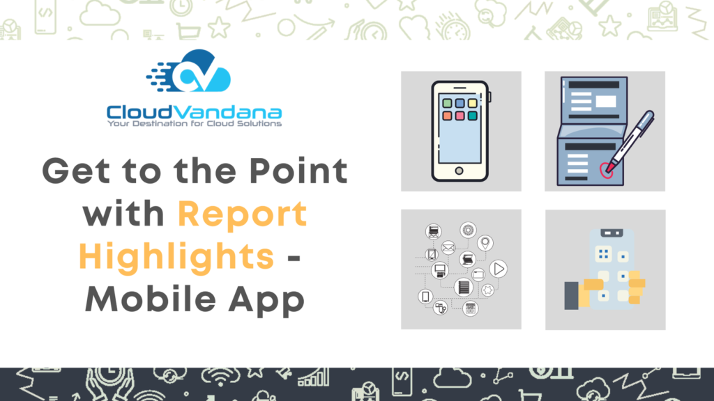
Explore how Salesforce Mobile App empowers teams with real-time access to CRM data, actionable insights, and streamlined workflows—anytime, anywhere. Boost productivity and decision-making on the go. In today’s velocity-driven business climate, executives, managers, and field teams can no longer afford to dig through spreadsheets or dashboards for critical information. Decision-making often happens between meetings, in transit, or mid-call. The mobile revolution in enterprise systems hasn’t just changed how work is done—it’s reshaped how insights need to be delivered. Salesforce’s Report Highlights in the mobile app represent a seismic shift in how business intelligence travels. It’s not about replacing full dashboards. It’s about distilling the signal from the noise—surfacing only what demands immediate attention. Let’s unpack what Report Highlights are, why they matter, and how to implement them effectively. Table of Contents What Are Report Highlights in Salesforce? The Purpose Behind Report Highlights Evolution of Mobile Reporting in Salesforce When to Use Report Highlights Where to Find Report Highlights Key Metrics Ideal for Report Highlights Creating Report Highlights in Salesforce Supported Report Types for Highlights Limitations to Consider How to Enable Highlights for Mobile Designing for Mobile Attention Real-World Use Case #1: Sales Leaders on the Move Real-World Use Case #2: Support Managers Real-World Use Case #3: Executive Stakeholders Governance Best Practices Performance Optimization for Mobile Security Considerations What’s Next: The Roadmap for Report Highlights Conclusion YOU MIGHT ALSO LIKE What Are Report Highlights in Salesforce? Report Highlights are compact, visually prominent metrics that appear at the top of a report in the Salesforce Mobile App. They’re designed to summarize key data points—typically one to three numerical fields that capture performance at a glance. Unlike traditional charts or dashboards, these highlights are unobtrusive yet impossible to ignore. They live right where users need them—above the fold, inside reports viewed on mobile. The Purpose Behind Report Highlights The core philosophy is simple: speed-to-insight. Highlights help users skip the interpretive work and instantly grasp what matters—sales figures, support loads, revenue deltas, case aging—without navigating tabs, filters, or charts. For executives, it means fewer dashboards. For reps, it means one-touch access to targets. For managers, it means agility in decision-making. And in all cases, it means better focus. Evolution of Mobile Reporting in Salesforce Salesforce has been steadily evolving toward mobile-optimized intelligence. What began as simple report views has matured into fully responsive dashboards and now purpose-built highlights. The rollout of Lightning Experience paved the way, but the real inflection point came when highlights became native to the mobile experience—no additional development required. When to Use Report Highlights Highlights aren’t for all data—they’re for mission-critical metrics. If it can change how someone acts in the next 5 minutes, it’s a candidate for a highlight. Report Highlights are not intended for every type of data. They are best reserved for metrics that are mission-critical—those that demand immediate awareness and drive real-time decisions. For instance, in the context of field service, these highlights can display the number of open work orders, enabling supervisors and technicians to prioritize resources efficiently. Sales managers can benefit from highlights that reflect key performance indicators such as quota attainment or daily bookings, helping them stay on top of targets without needing to dig through complex dashboards. Similarly, customer satisfaction teams can monitor performance with metrics like the average CSAT (Customer Satisfaction Score) or the number of survey completions. These indicators allow quick interventions when satisfaction dips. In sales operations, the highlights can summarize opportunity pipeline metrics—such as deals closing this week or forecast accuracy—giving teams a clear sense of urgency and alignment with quarterly goals. In each scenario, Report Highlights become a lightweight yet powerful lens for strategic decision-making. Where to Find Report Highlights Users can access highlights in: They appear at the top of the report before any rows or charts—no scrolling required. Users can access Report Highlights in several key areas within the Salesforce mobile experience. The most direct route is through the Reports tab, which is optimized for mobile and presents highlights at the top of each applicable report. These summaries provide instant context before a user even scrolls through detailed data rows. Additionally, custom Lightning Pages that include report components can be configured to display highlights natively on mobile devices. App-specific tabs, which can be prioritized through mobile navigation menus, also serve as effective locations to surface these KPI summaries. In each case, Salesforce ensures that the information appears prominently—immediately visible when a report is accessed on the mobile app, without requiring any additional taps or navigation. Key Metrics Ideal for Report Highlights Report highlights shine when they show trend-sensitive metrics like: Each of these gives a pulse reading—what’s working, what’s not, and what’s urgent. Creating Report Highlights in Salesforce To build highlights: Once saved, these highlights are automatically surfaced on mobile. Supported Report Types for Highlights Highlights work best on: They do not currently work with: Choosing the right report type is foundational. Limitations to Consider No feature is without trade-offs. Highlights: Still, the value they bring for top-line awareness is enormous. How to Enable Highlights for Mobile Admins should ensure: This is a configuration task—not development work. Designing for Mobile Attention The small screen forces clarity. Highlights should: Design with distraction in mind—every pixel matters. Real-World Use Case #1: Sales Leaders on the Move A VP of Sales walks into a weekly pipeline meeting and, with two taps, sees: That’s all it takes to guide the meeting—not a single spreadsheet involved. Real-World Use Case #2: Support Managers A Support Director reviewing highlights at 9 AM can view: With that, they know where to focus resources for the day. Real-World Use Case #3: Executive Stakeholders Boardroom dashboards are overkill for executives. Report highlights inside the mobile app offer: No need to wait for a BI team to prepare slides. Governance Best Practices Admins and analysts must establish: Metrics without context or governance are dangerous. Performance Optimization for Mobile Fast-loading highlights require: Lightweight reports lead to lightning-fast insights. Security Considerations Report highlights obey: Ensure that KPI


